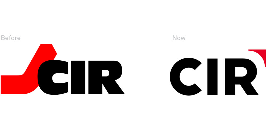
Since its founding, in 1976, the logo has never changed. Today, between innovation and continuity, the new identity profile.
The direction towards innovation, the choice of an authoritative and never austere lettering, the dynamism that represents growth and movement. These are the fundamental concepts that shape new CIR brand and corporate identity. The design of the new brand logo passes through very specific semantic, formal, and chromatic traits.
The arrow of the new logo points upwards, and is related to the idea of growth, the history and solidity of the company passes through the choice of traditional and recognizable colors: CIR’s black, red, and white. Bringing again the element of dynamism under the light, we changed the brand logo into two-dimensional and three-dimensional textures, reproducing it in all supports of integrated communication.
«Proud to have taken part in a historical change».
Emanuele Cappelli
CIR logo has never changed since 1976, the year of the holding foundation. We are proud to have taken part in a historical and important change like this, and to have been able to tell in our way: a new synergy made of history and change.
«Addressing the first restyling of the CIR brand logo – a company that oversees various sectors as leaders – is a challenge that undermines the usual design phases.
Every choice of semantic, formal, and chromatic meaning must be well considered and managed, without ever losing sight of commercial and positioning aspects. In this case, it was a question of working on the identity and value aspects.
It was an important demonstration of trust by the holding company that allowed us to start a research aimed to the balancing between innovation and continuity.
The outcome is a dynamic, coherent, and always recognizable system».
Emanuele Cappelli
Related Services
- Brand identity
- Type design