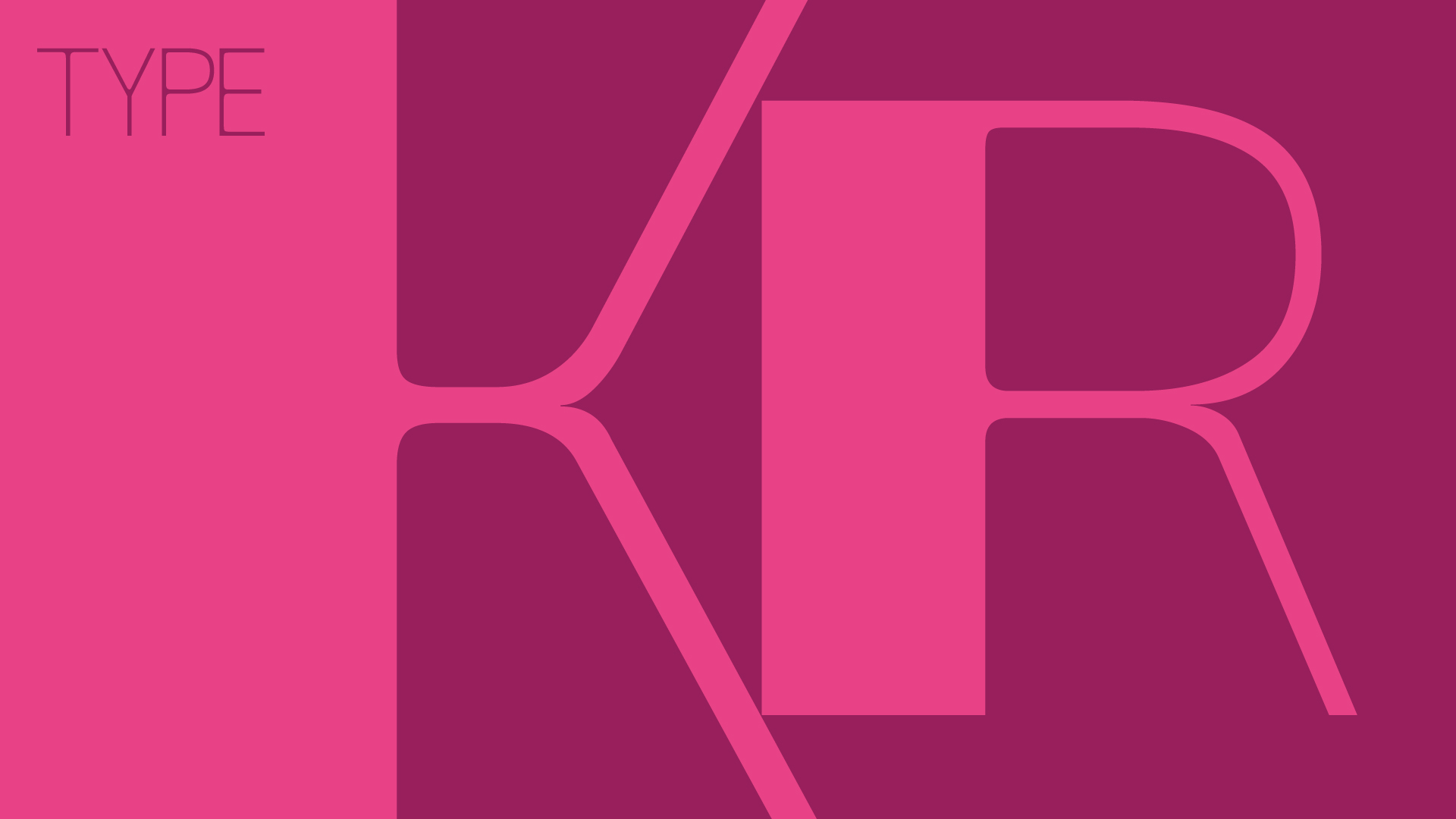
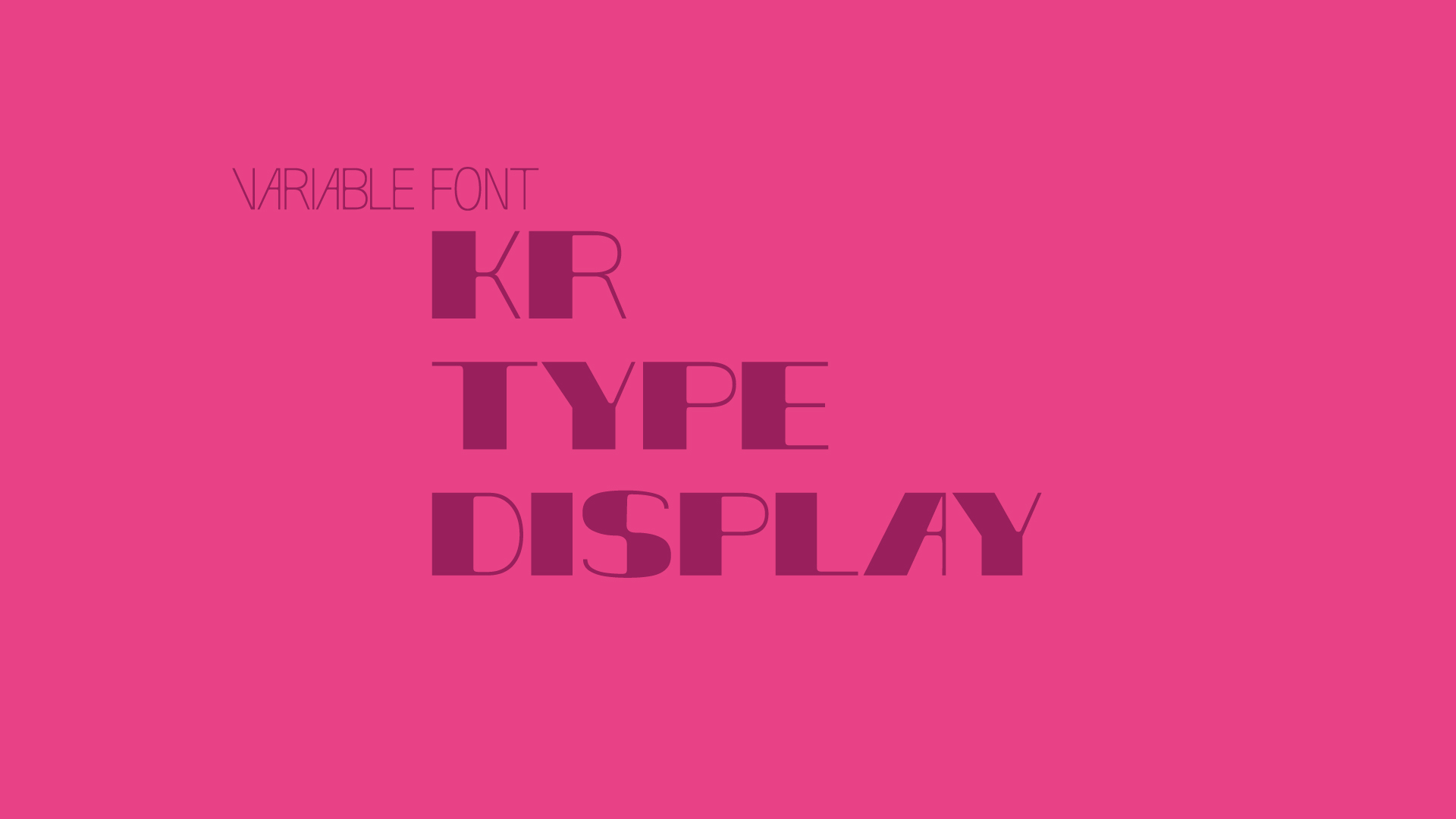
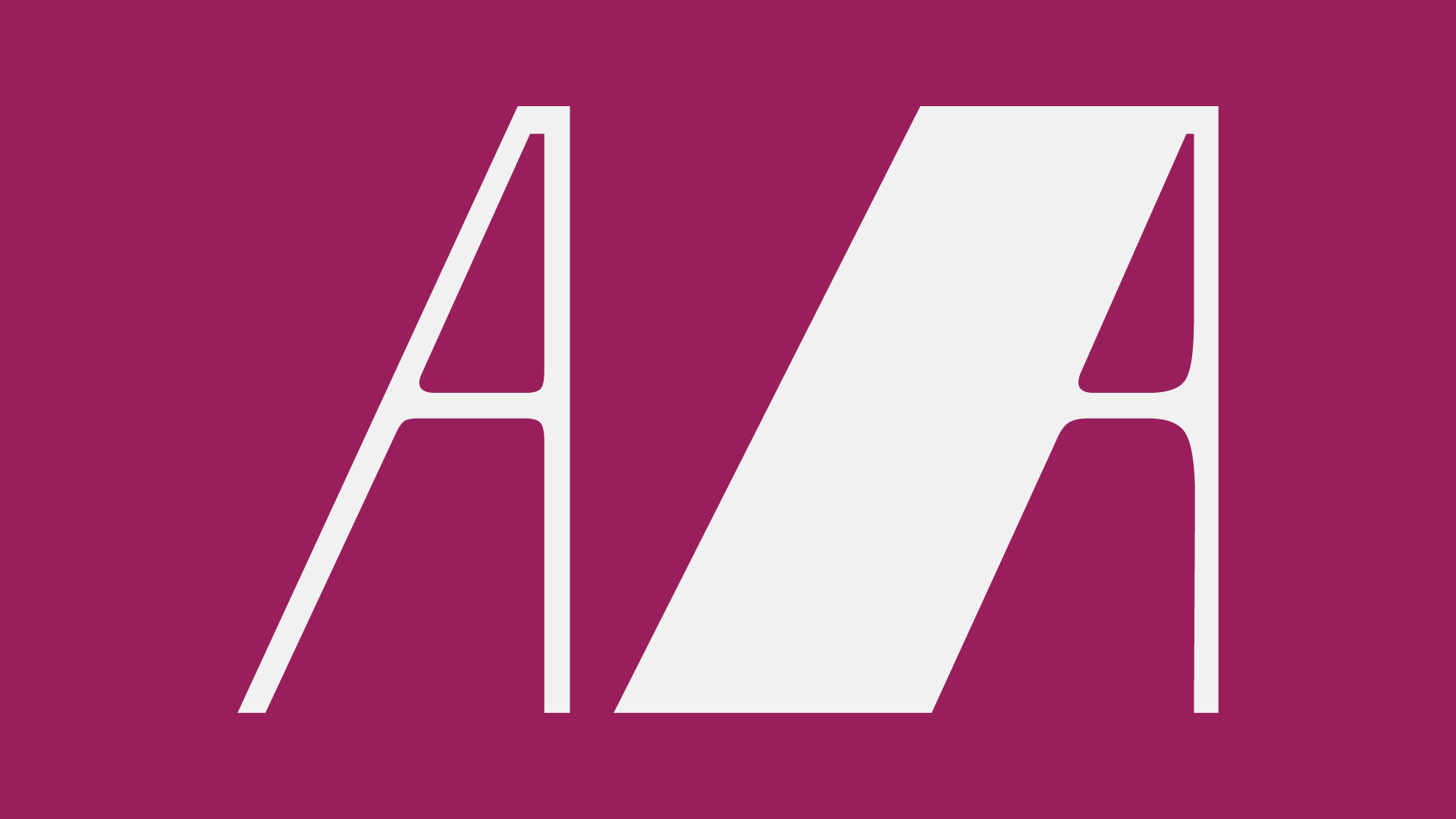
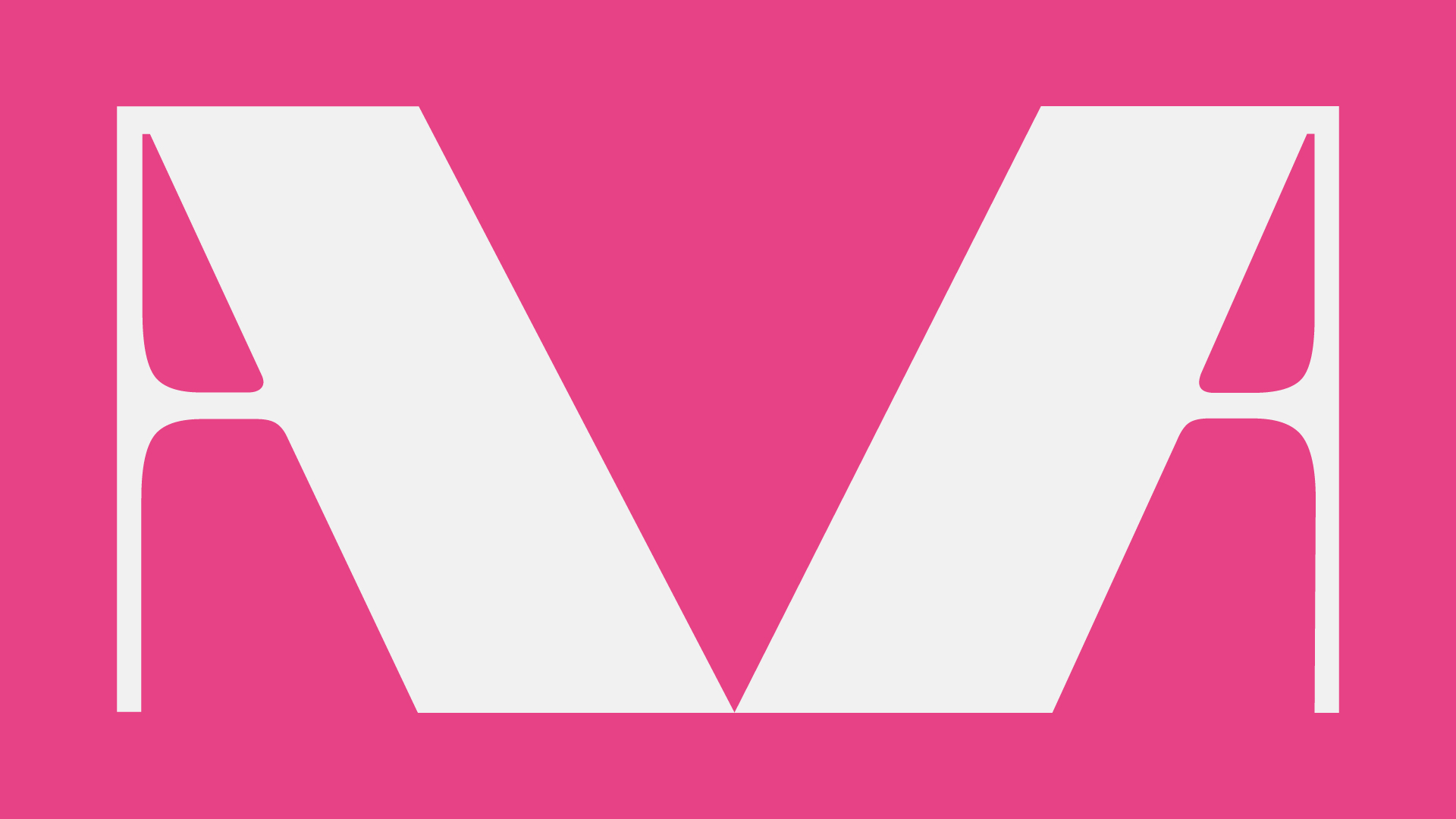
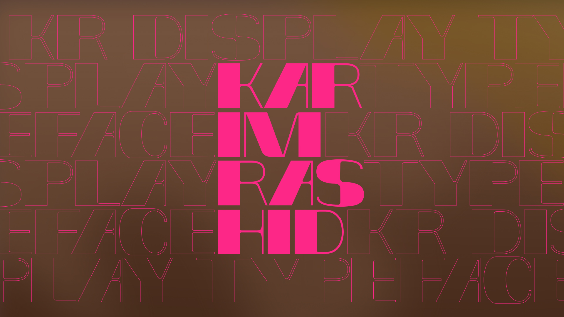
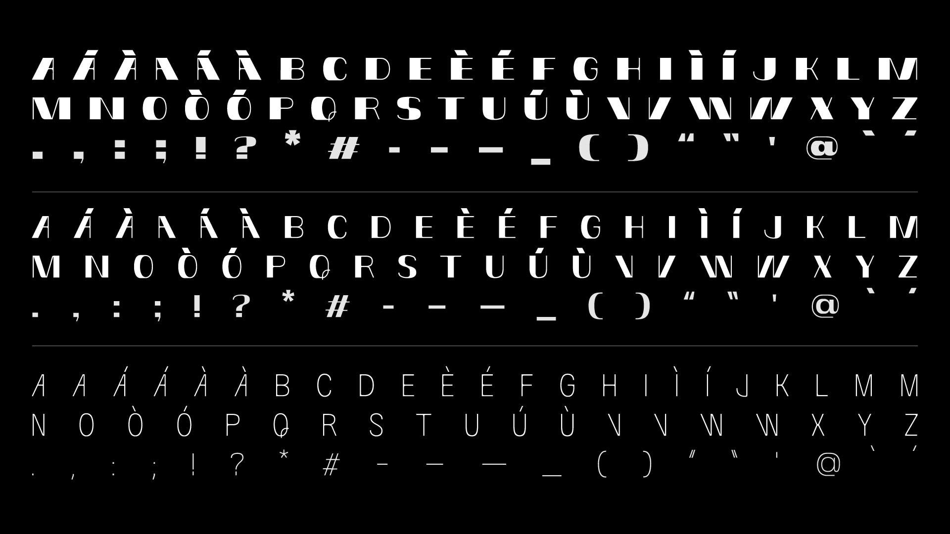
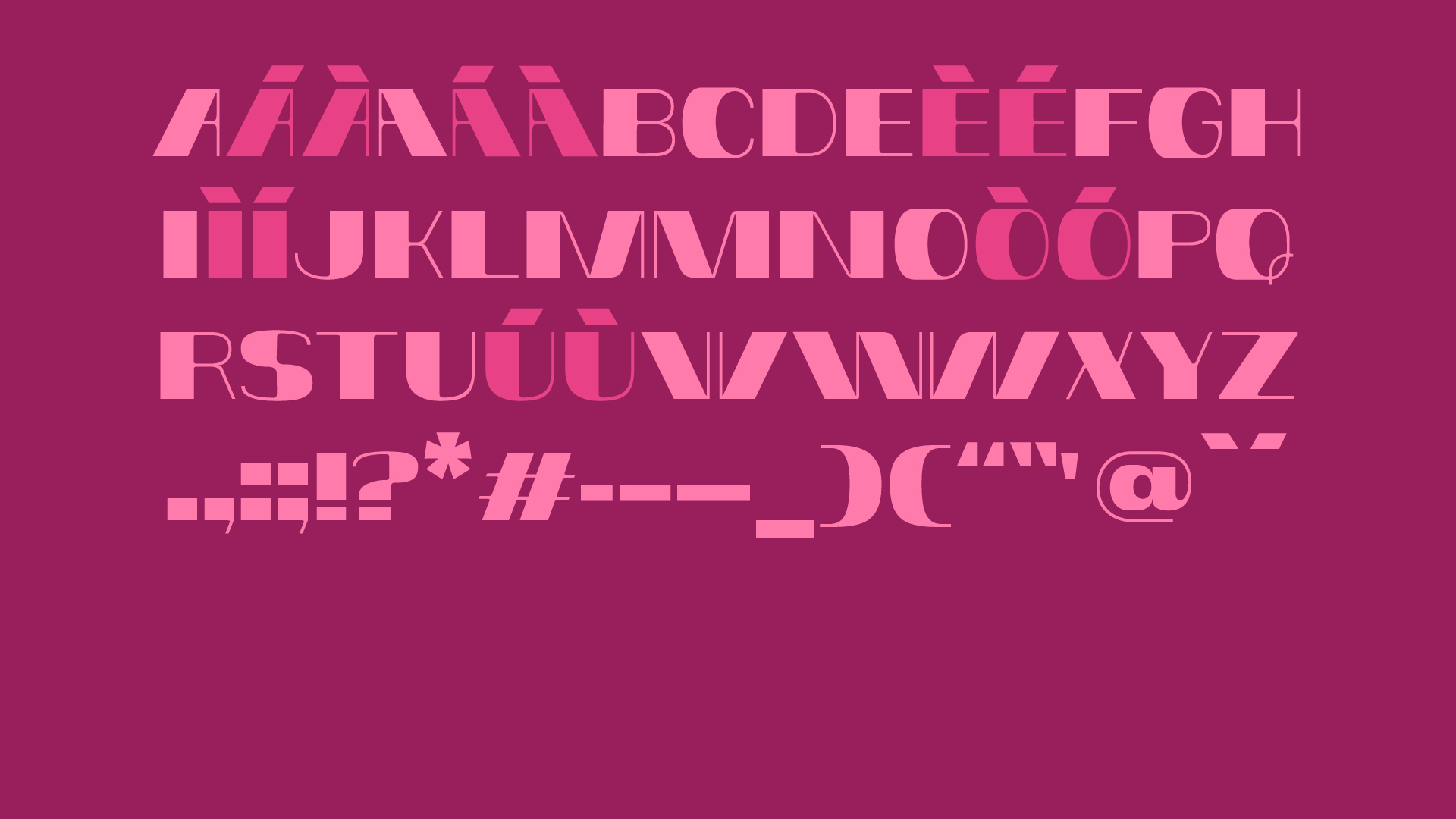
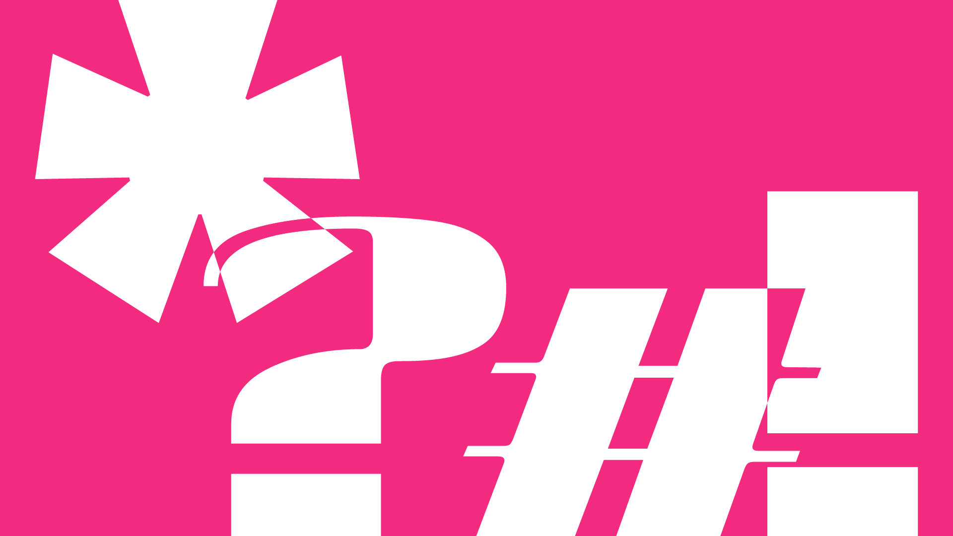
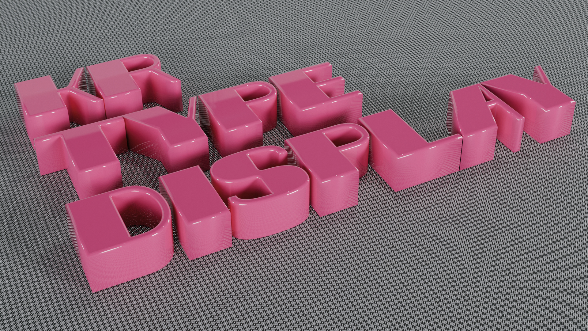
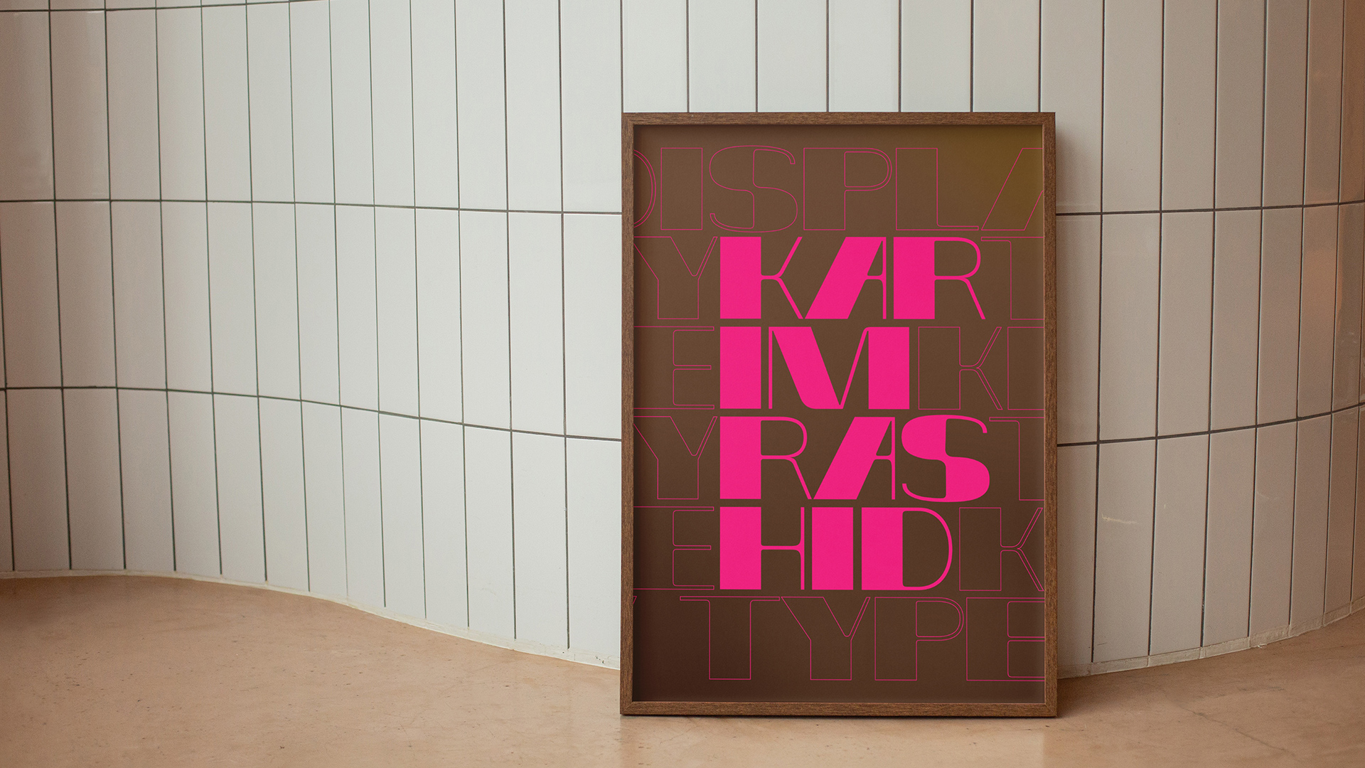
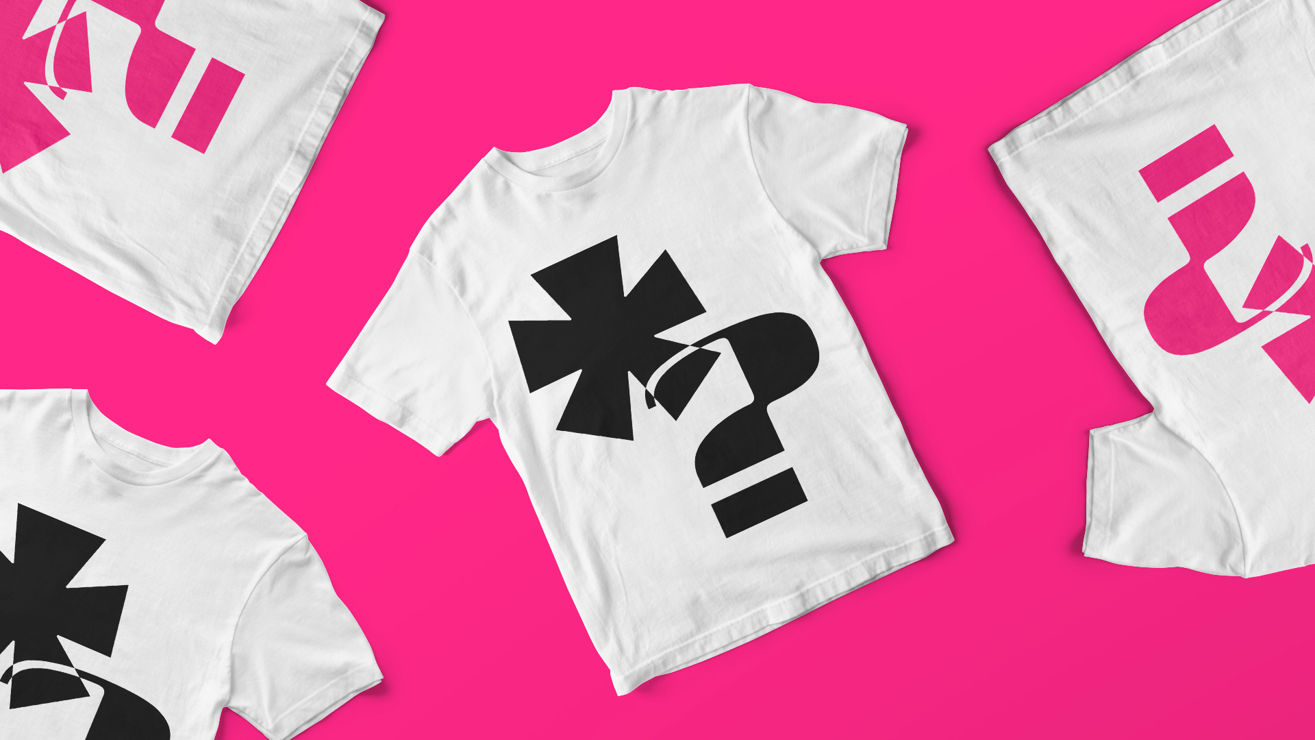
Inspired by Karim Rashid, we imagined and designed a variable font that refers to the distinctive features of a design that expresses sinuosity of form on the one hand and non-linearity on the other. Thus we designed KR Type, a typeface where the right side remains unchanged and the left side becomes a body designed in a modular expansion.
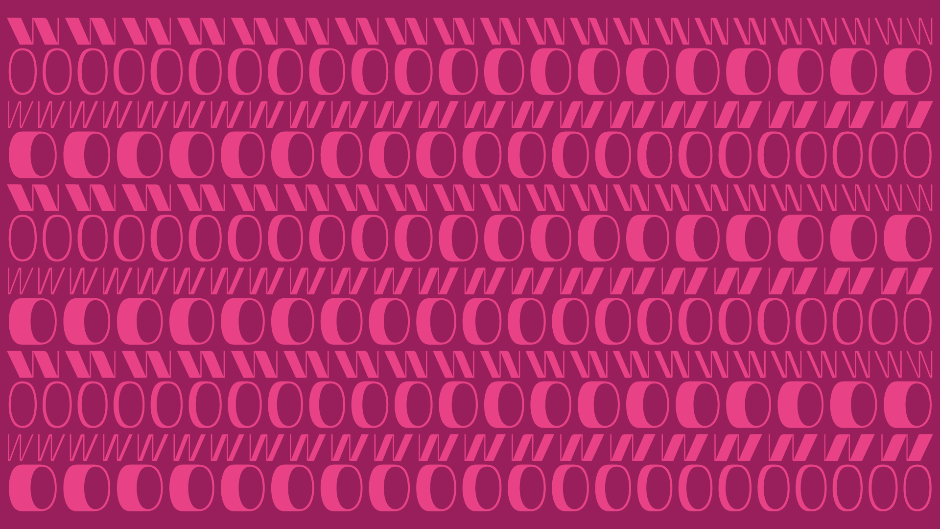
Drawing a horizontal line in the central part of the glyph always results in the same height: this is a peculiarity of KR Type that contrasts with the standards of optical corrections. According to Rashid, objects should solicit our emotional and sensual side: the challenge becomes to bring them closer to us by making them more human. An increase in font thickness according to a modular grid alludes to a bodily expansion: the characters become a reflection of the human that is stimulated and excited by the objects themselves.
The variability between the thickness of the characters makes the font ideal for titling. In this way we have suggested an effect that succeeds in replicating the geometry and morphology of a design and celebrates a lifestyle under the banner of the contemporary. A palpitation tuned to modernity where design plays the role of animating each character.
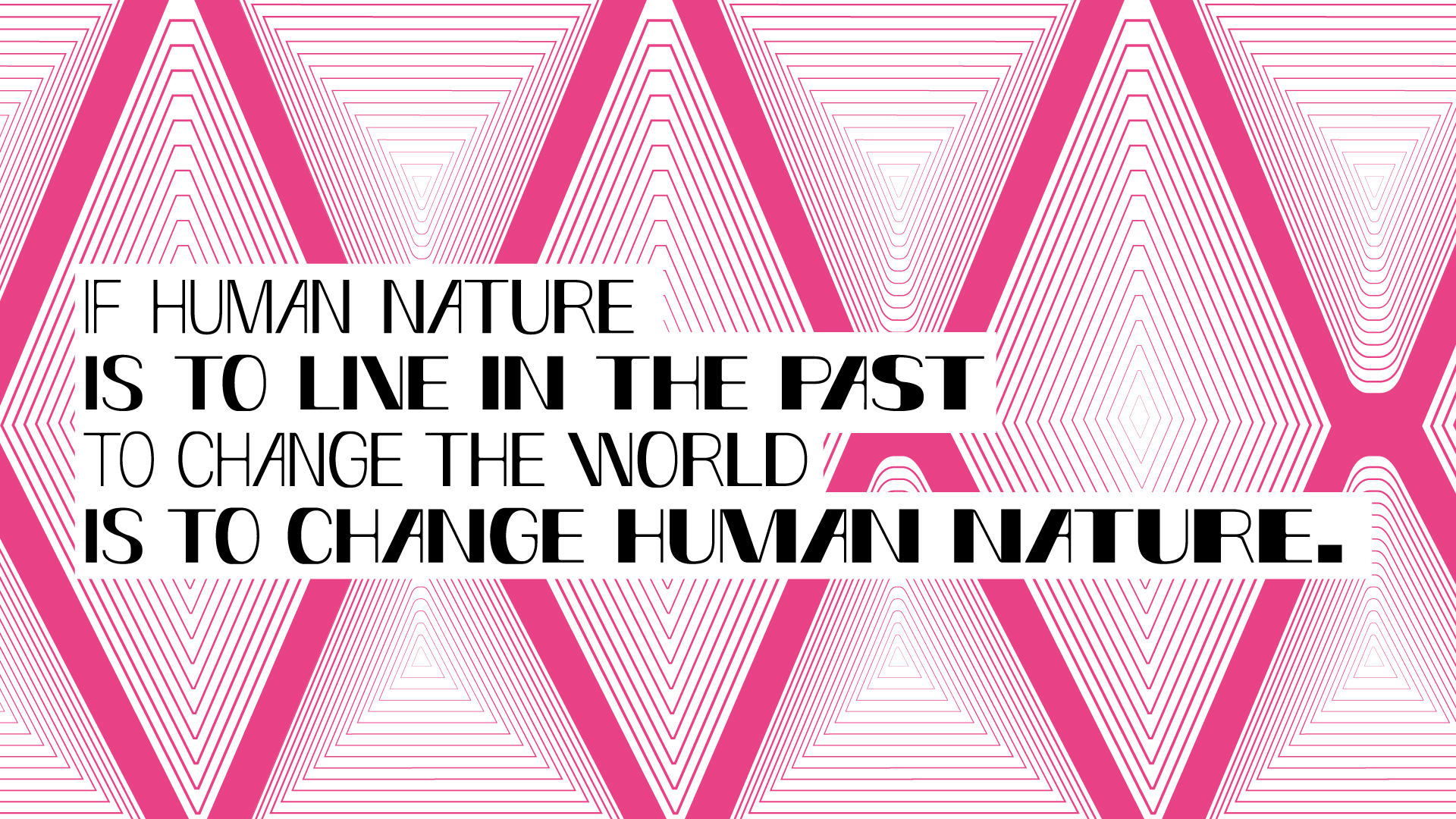
«If human nature is to live in the past, changing the world means changing human nature».
Karim Rashid
Morphology.
Breathing.
Contemporary.