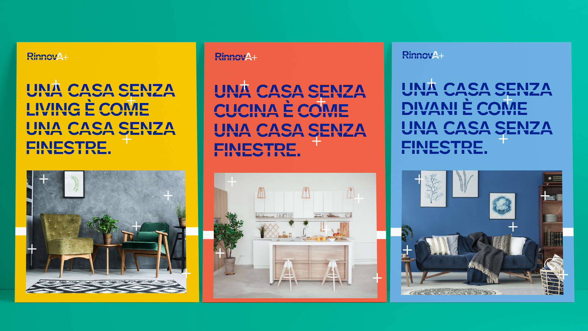
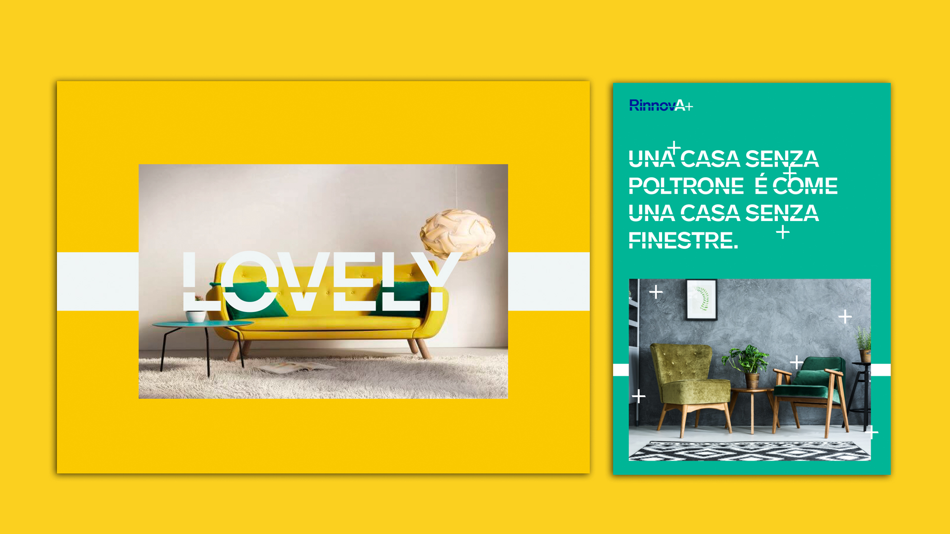
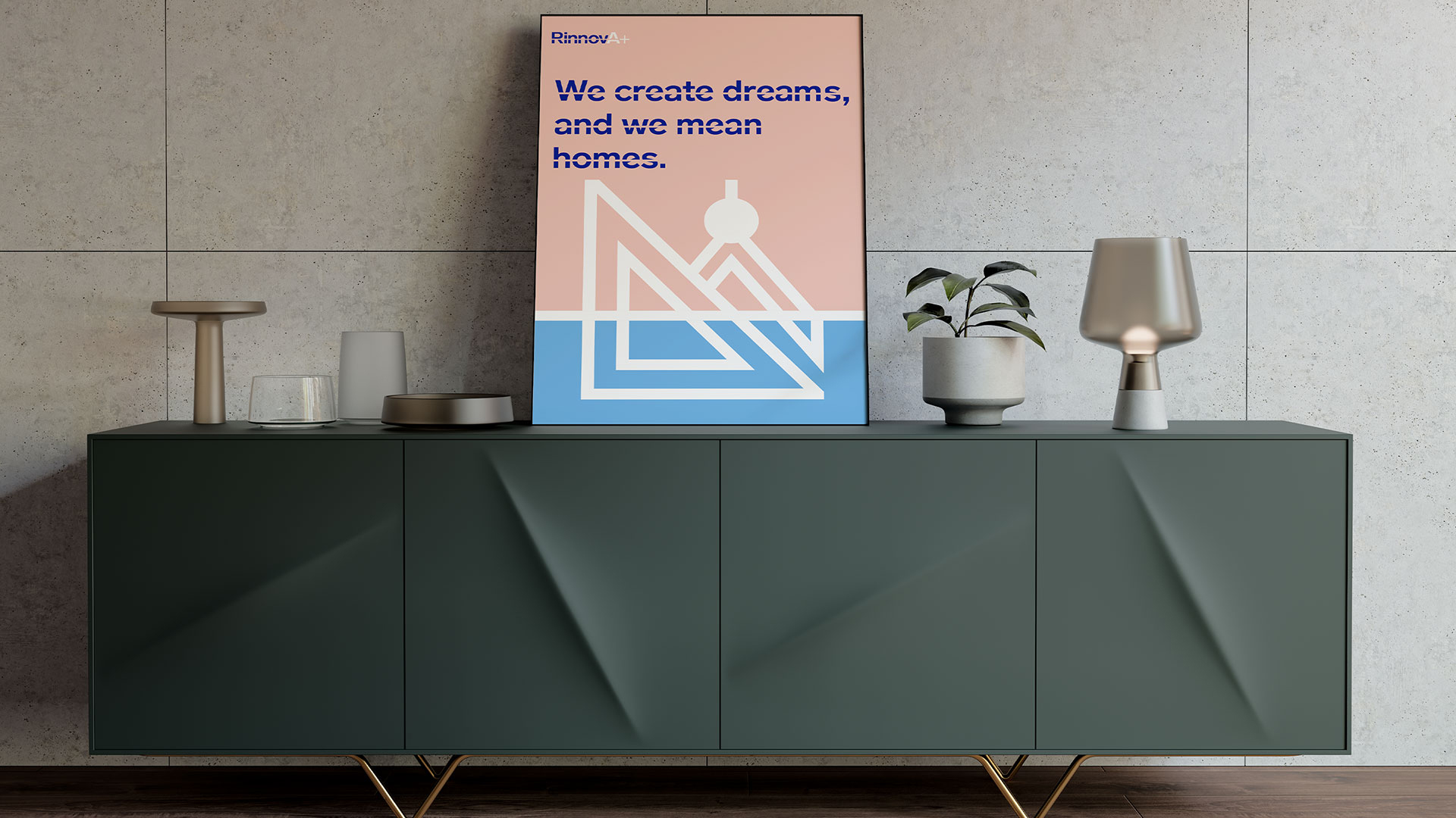
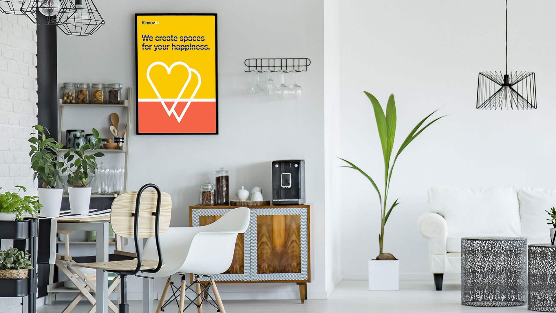
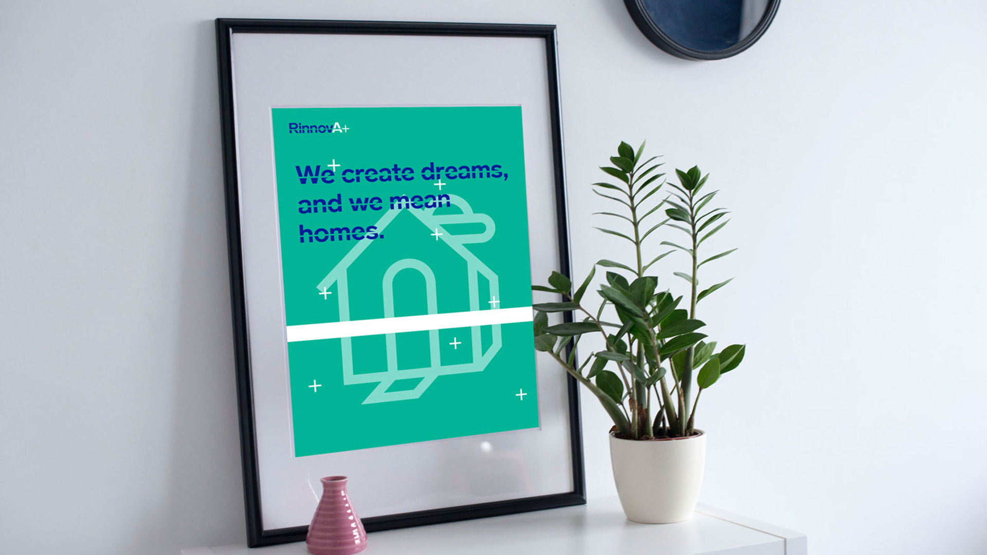
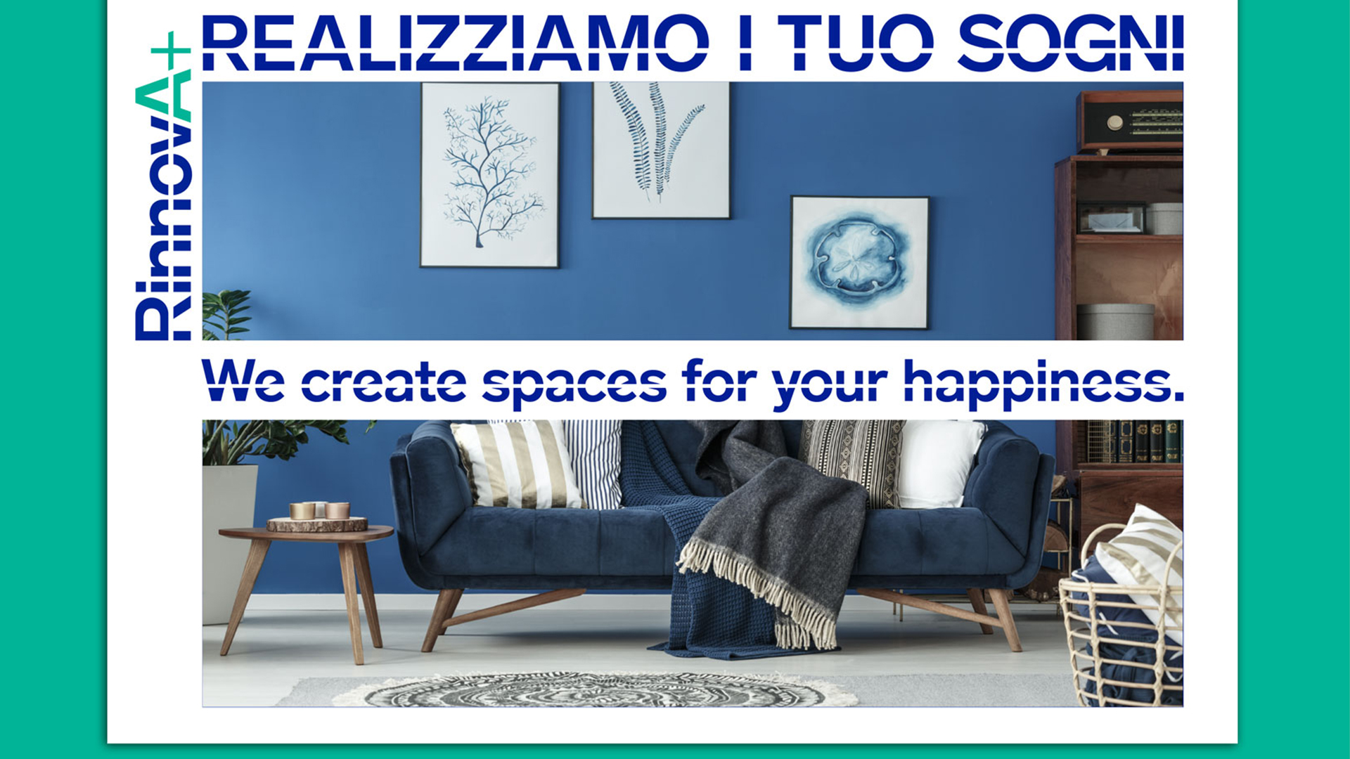
We developed a visual identity to implement RinnovA+ repositioning on the web whose keyword is “versatile”. The visual and conceptual message gets to the target’s heart as fast and straight as an arrow.
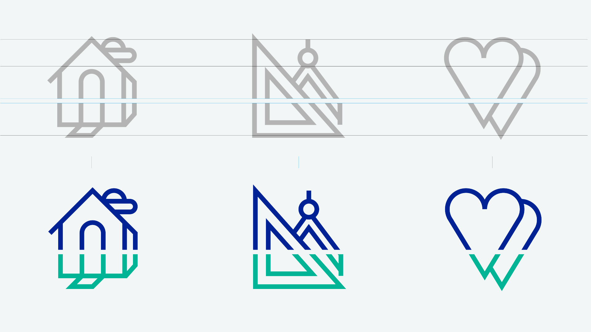
RinnovA+ visual identity tells the company’s ability to rebuild and renovate any kind of house. The line is the key to reading words: it allows openness, flowing, extension, addition and repetition of the modules, and represents the versatility so crucial to RinnovA+ repositioning.
Connections and Creations.Matter and Idea.Formula.
Services
Editorial design
Creative Direction
Emanuele Cappelli
Design
Andrea Fiori
Content Strategy
Arianna Cappelly