The illustrations therefore act as a bridge between data and people, and between institutional communication and the real-life stories of those who benefit from the projects. They immediately convey the human and collective value of the activities promoted by Fondazione TIM.
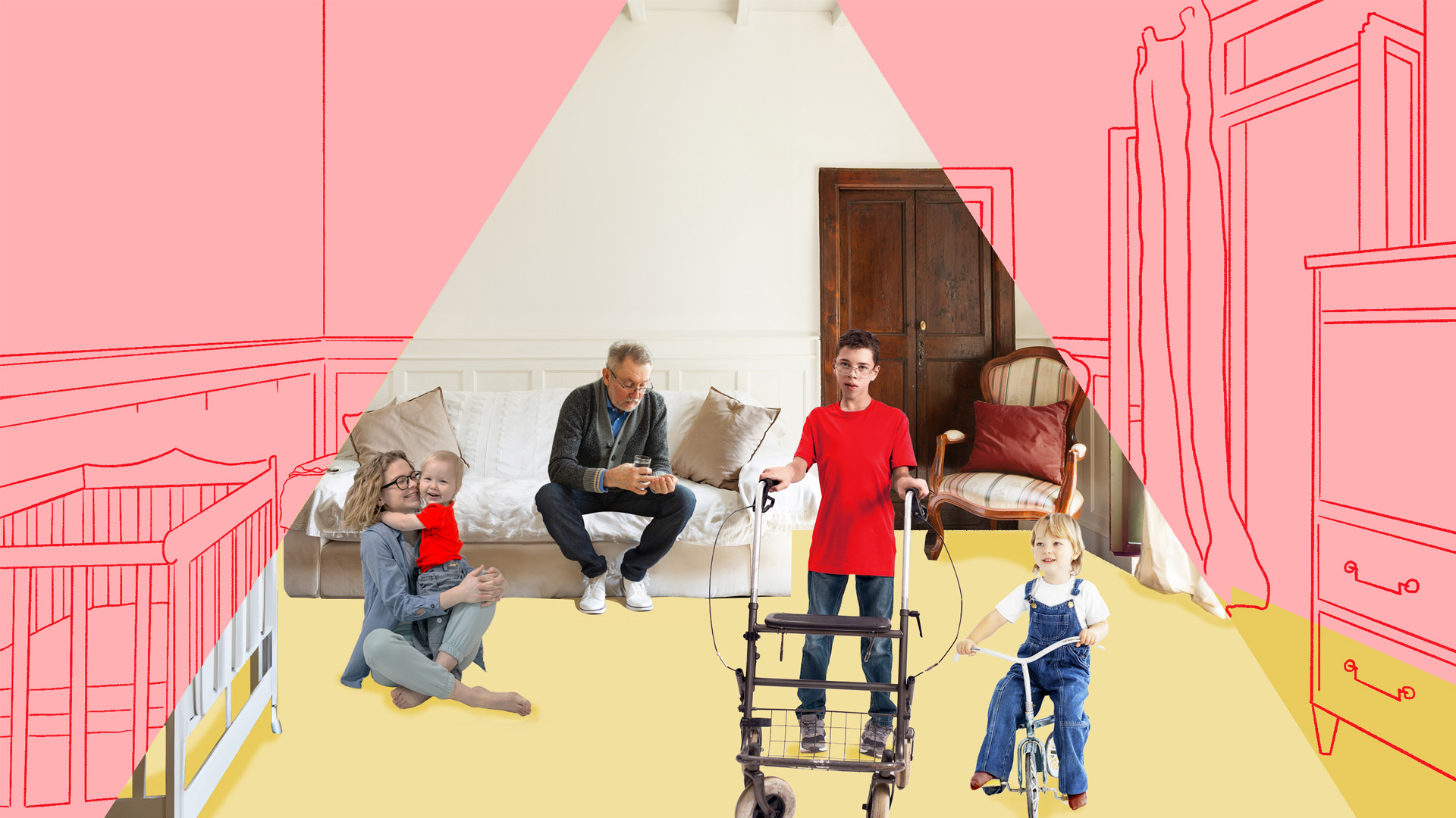
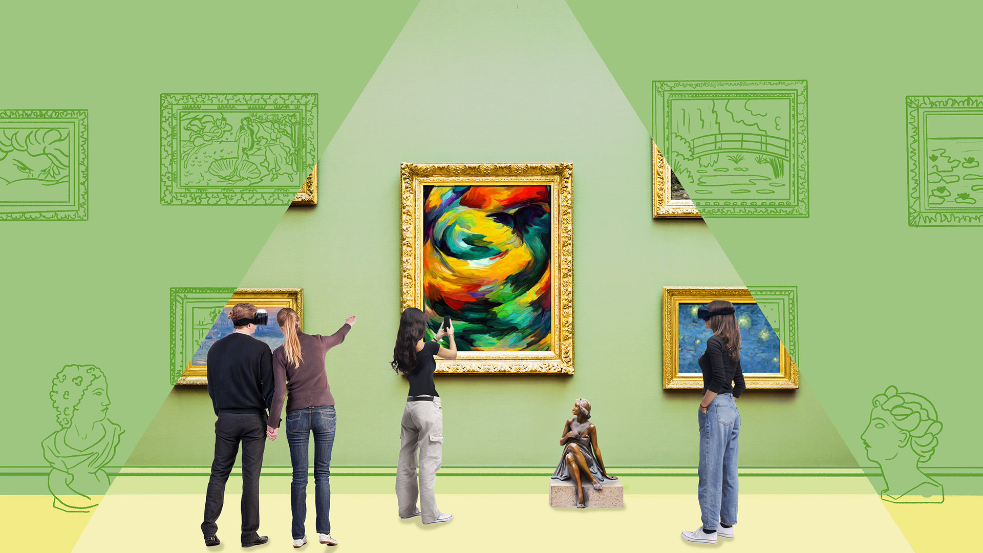
The illustrative style, based on the concept of looking together to see further, combines realism and abstraction. Photographic scenes depicting real people and situations blend with essential geometric illustrations constructed from colour fields and vector lines. Each panel is defined by a unique perspective of light and space to guide the eye and distinguish the different thematic areas, each with a precise chromatic identity: green for culture, blue for education and red for inclusion.
The result is a consistent and dynamic visual language which accompanies users as they discover Fondazione TIM’s projects, facilitating clearer, more immediate communication.
We will delve into the origins of the initial visual proposal and the steps that led to its creation: