Associazione Archivio Storico Olivetti collects and disseminates Olivetti’s huge artistic heritage.

We designed its Digital Identity through different style languages to achieve the perfect balance between historical significance, contemporary significance, and innovation.


To improve the website’s fruition, we focused on User Experience to guide users across an interactive path that presents and shapes contents into several thematic routes.

The user can benefit from a fluid and immersive surfing experience free of horizontal and vertical space references.

Olivetti’s Tale.
Unfolding the future.

Services
Brand identity
Copywriting
Digital design
UX & UI design
+ More

In this project, we also redesigned the digital brand identity to generate structured elements: typefaces, color palettes, icons, and symbols.

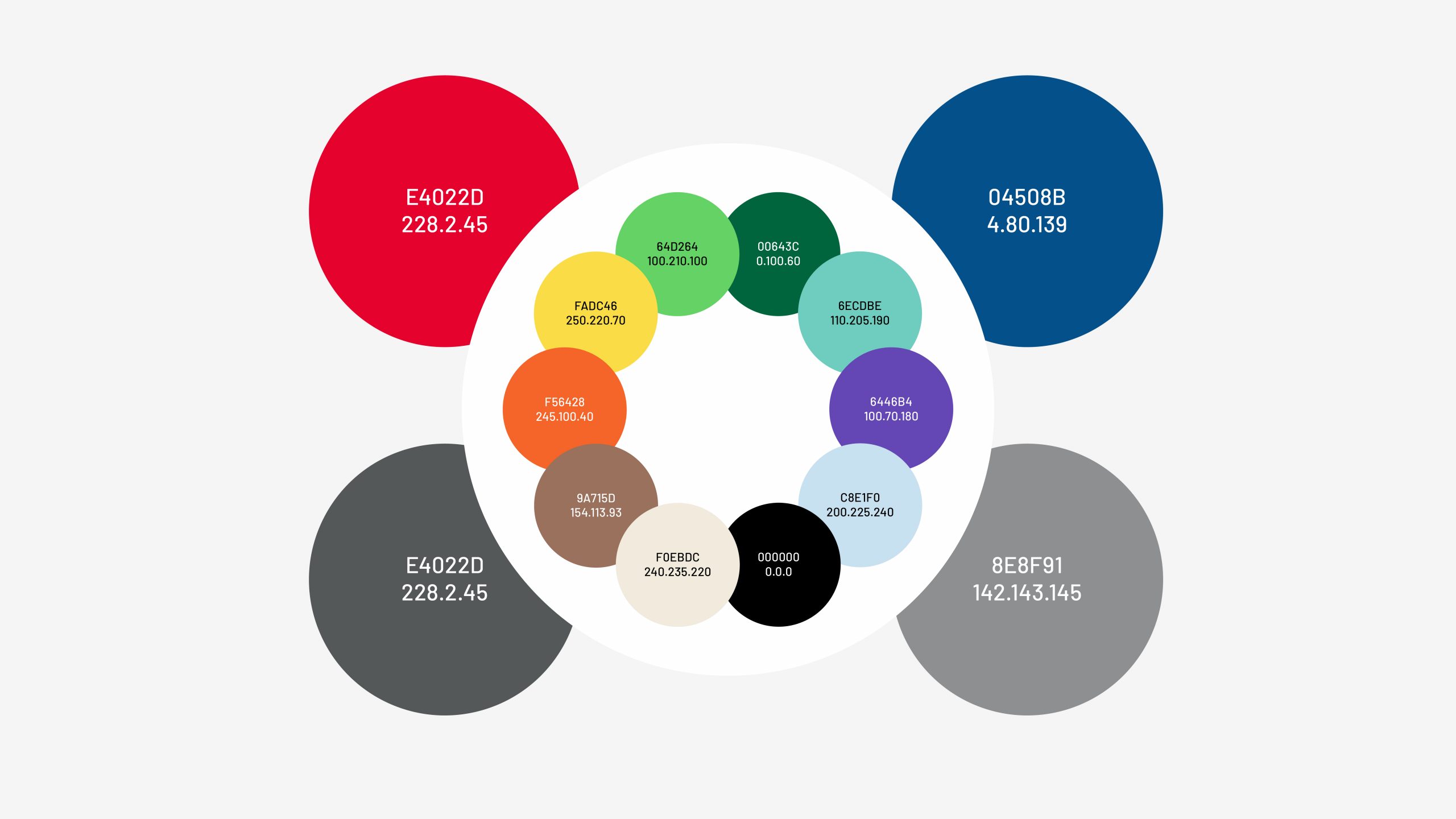
We started from Olivetti’s identity colors, red and blue, sampled from the company’s historical advertising materials, to draw a solid color palette with future-oriented nuances. The palette consists of chromatic pairs used to distinguish the website macro-areas.

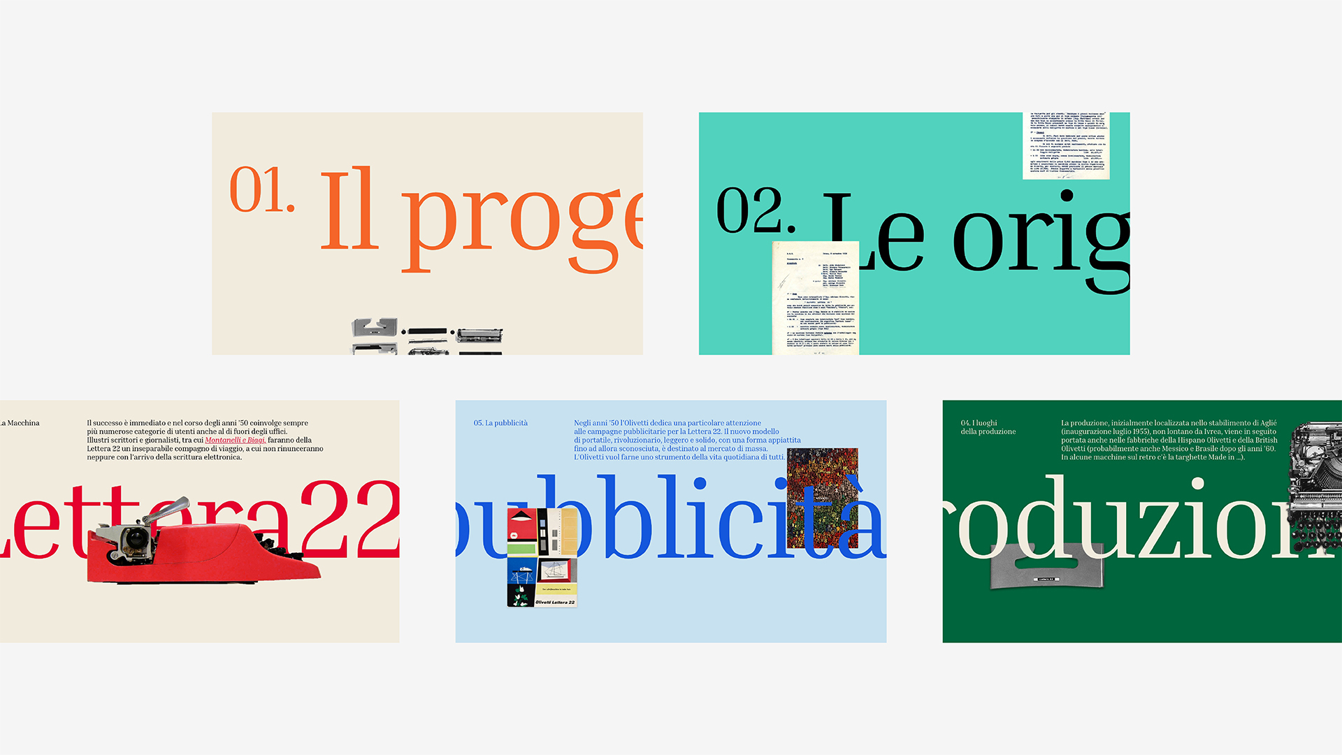
In typography, we identified two google fonts. The Inria Serif font – used in headings and primary texts – to underline Olivetti’s historical heritage harmoniously combines with the Barlow font, characterized by rounded edges and a rectangular cage recalling Olivetti’s most innovative, industrial, and mechanical features.

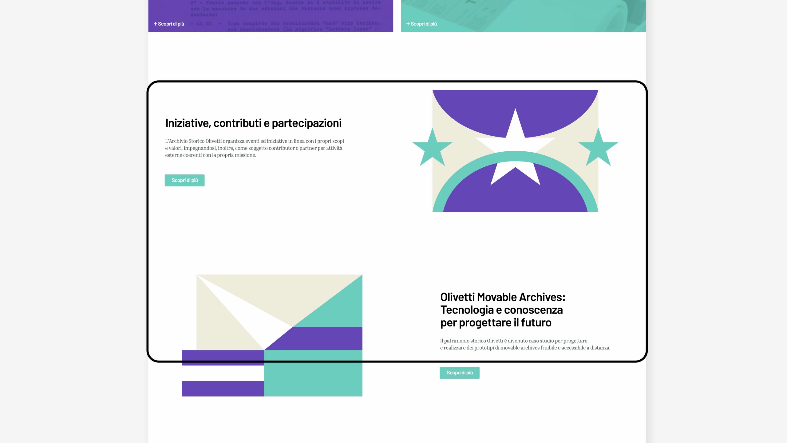
Olivetti’s digital identity is further conveyed through a set of icons and a system of animated pictograms, featuring strong geometrical lever, innovative minimal and effective digital interpretation, and an updated review of Olivetti’s style and history.

In line with the current communication strategy, this new and modern user experience for the community of the Associazione Archivio Storico Olivetti is an important step taken by Olivetti in its #StoriaDiInnovazione. The interactive paths provide a new dynamic way to showcase our honored fortune to preserve, protect, and share. Among these is Project OT L22, namely the design of a font inspired by the new version of Letter 22, to celebrate the 70th anniversary of its creation, started in 2020 and prosecuting this year.

Gaetano di Tondo, President of Associazione Archivio Storico Olivetti VP, Head of Communication & External Relations in Olivetti

Creative Direction
Emanuele Cappelli
Design
Emanuele Cappelli, Andrea Fiori
Motion Graphics
Giulia Martino
Project Management
Massimiliano Napoli
Web Development
Pasquale Ricciardi
Communication & External Relations
Fabio Zanino