For us, Olivetti is a benchmark for its corporate philosophy. When we were hired in 2014 to promote its legacy, Emanuele Cappelli conceived and developed the Olivetti Design Contest together with Federica Moroni, then the company’s Institutional and External Relations manager.
The Olivetti Design Contest was born with the aspiration to revisit Olivetti values in a non-nostalgic way. Tradition and innovation should always be experienced as a pair, never as a dichotomy, and this golden rule applies all the more in the case of the perimeter of things and meanings, corporate identity and talents represented by the past, present and future of the Olivetti cultural code.
Federica Moroni
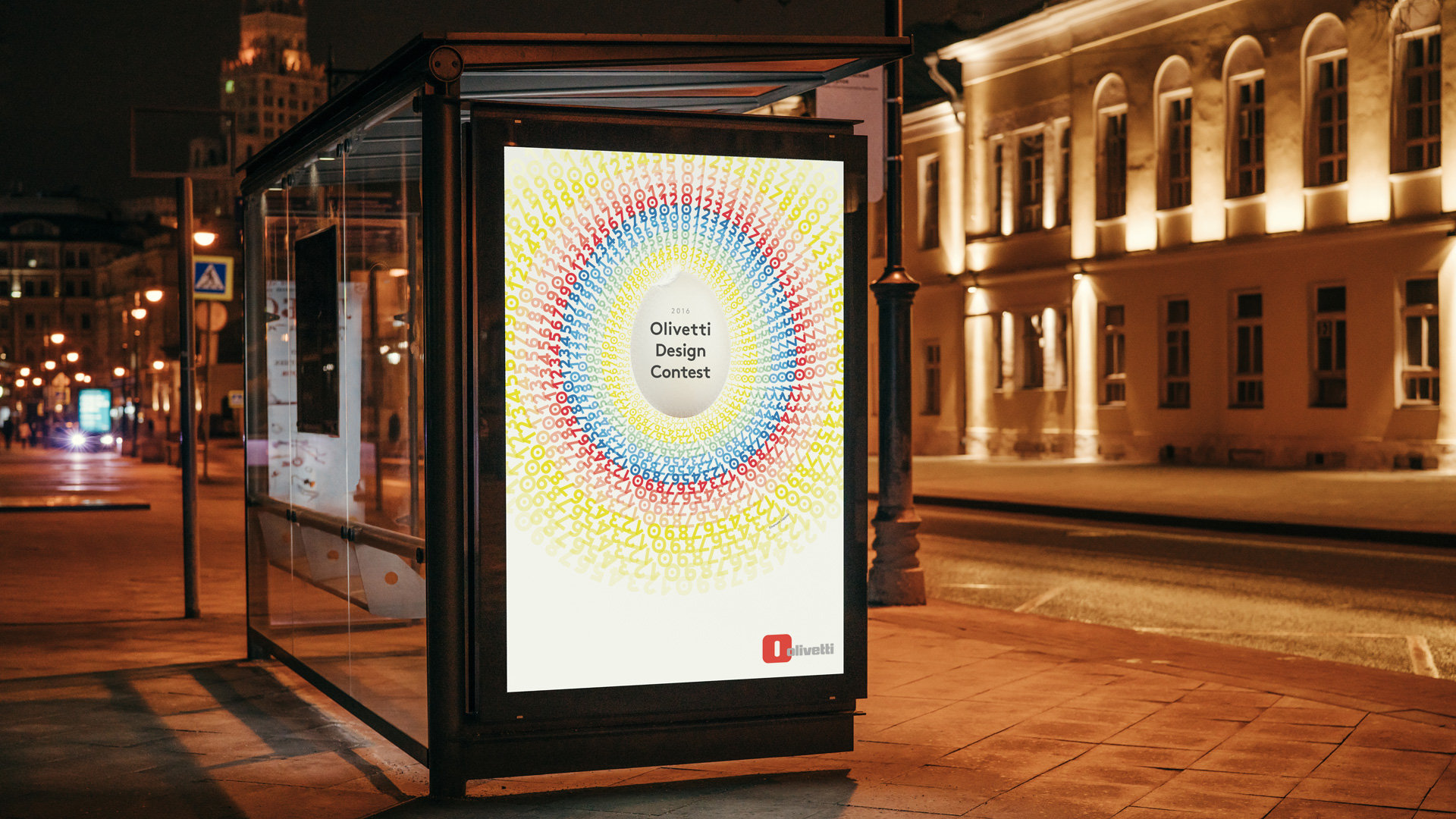
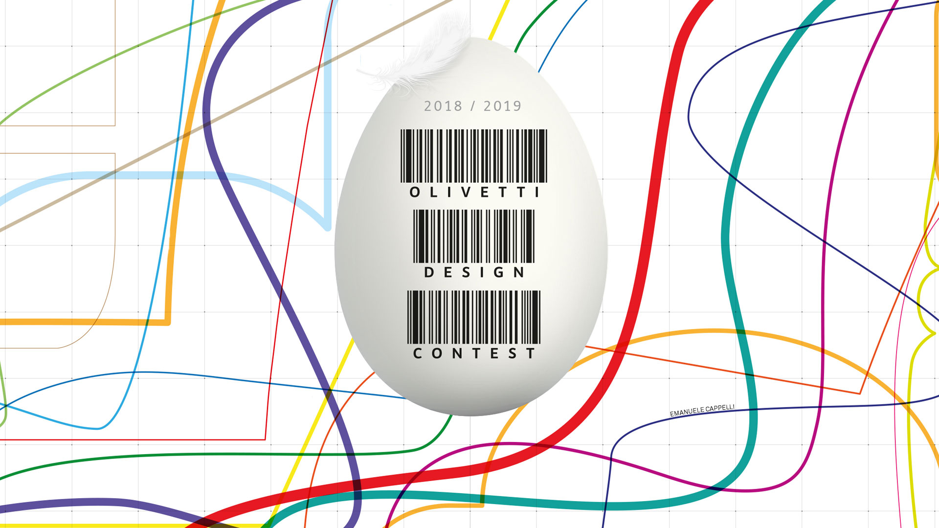
Witnessing the entire design process of the posters, signed by Emanuele Cappelli for the various editions of the contest, and then seeing them displayed next to those of Pintori, Glaser, Nizzoli, Sottsass, Ferrari, Pieraccini and many others is a very interesting and enriching aspect. The symbol of communication is the egg, which represents the perfect creation, made ironic by the presence of a feather that reveals its origin. The Olivetti Design Contest egg represents the birth of the designers of the future, a metaphor made even more evident by the other elements of the visual, which vary each year based on the product whose design is required.
The egg is a perfect shape even though it comes out of the ass.
Bruno Munari
The Olivetti Design Contest, now in its fourth year, in 2020/2021 has been dedicated to Type Design, the design of the new Olivetti typeface, which once again demonstrates the company’s focus on innovation by entrusting artists and young designers to design the company’s new typeface.
Natural Style of Creation.It’s Design.