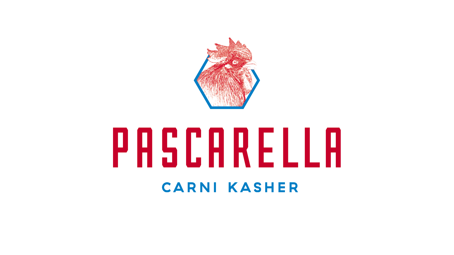
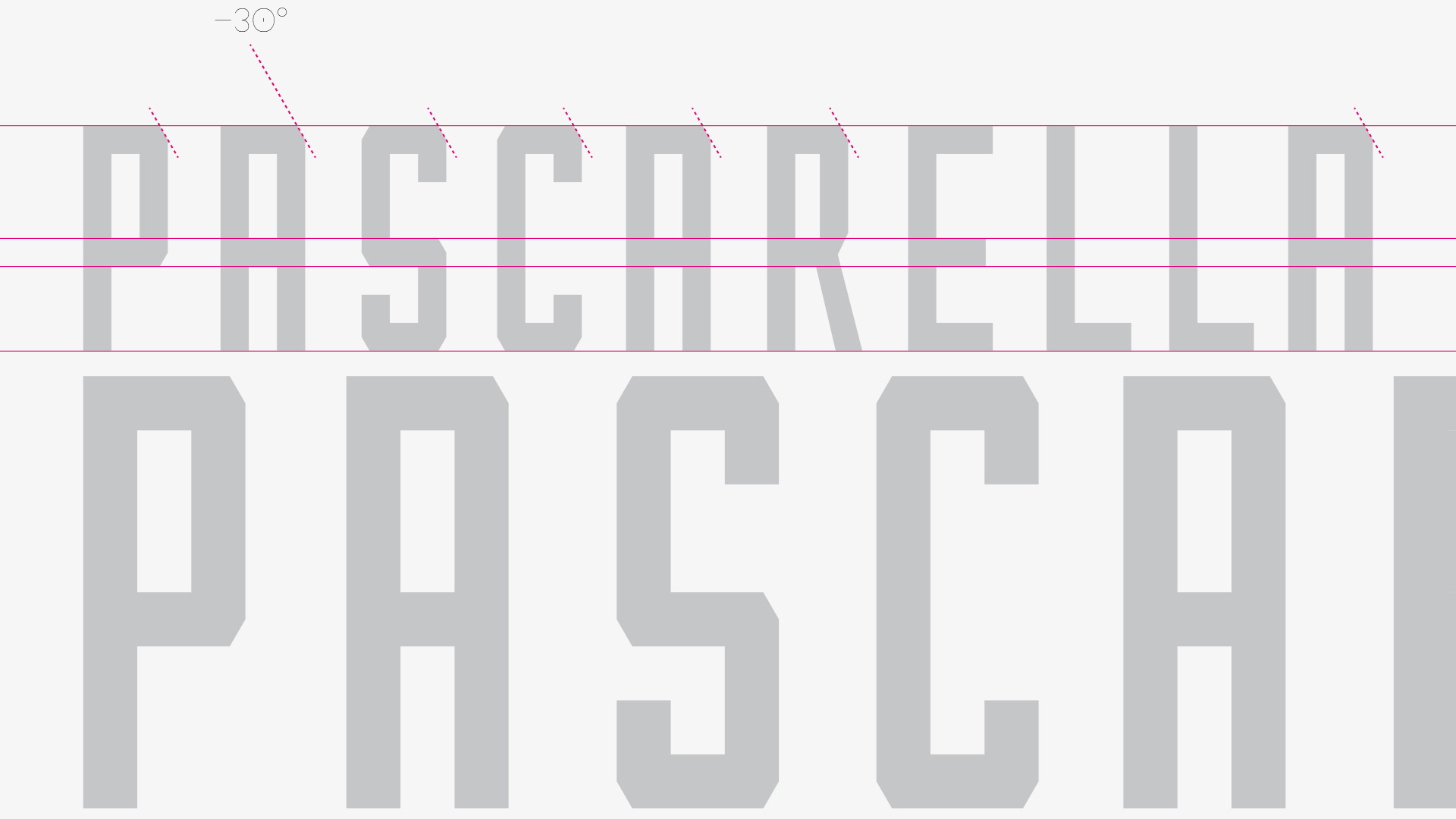
The Brand Design and Corporate Identity project for Pascarella Carni Kasher is based on a thorough analysis of the target market and on distinctive characteristics of the business: quality of products, friendly atmosphere, expertise, and respect for tradition connected to innovation.
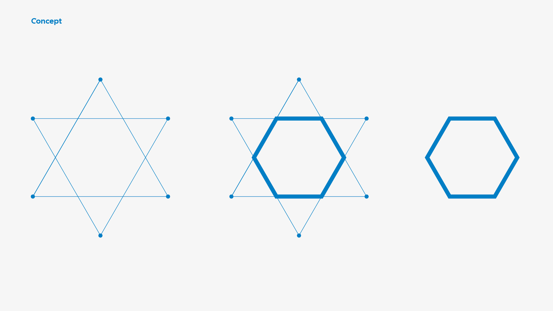
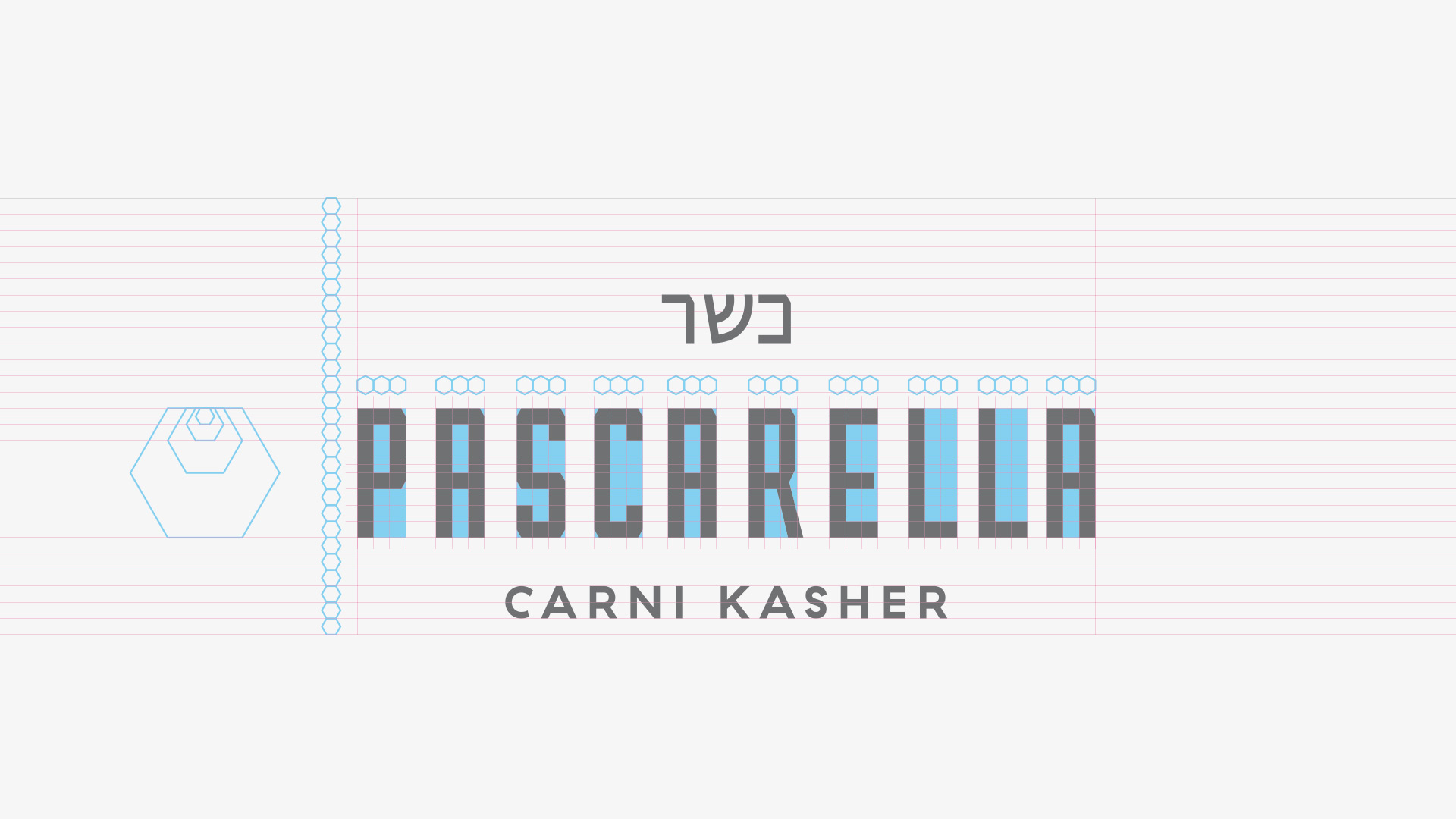
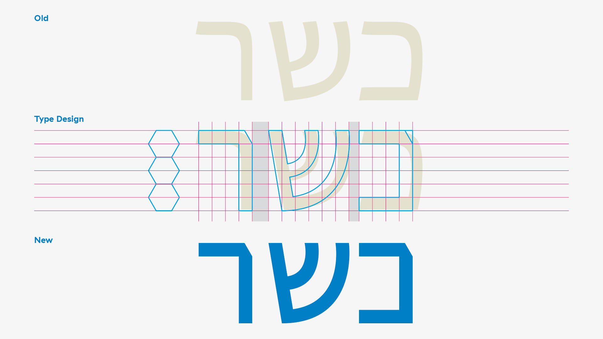
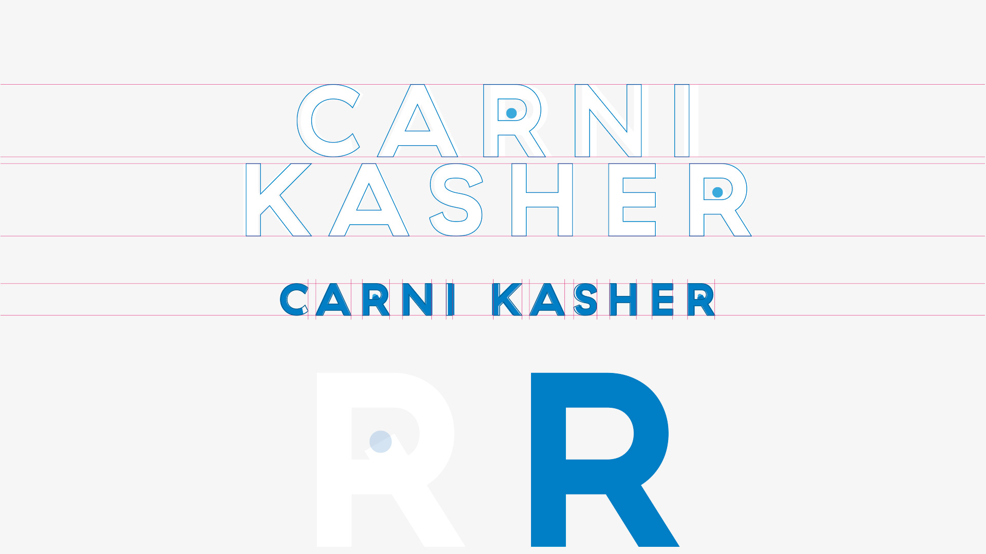
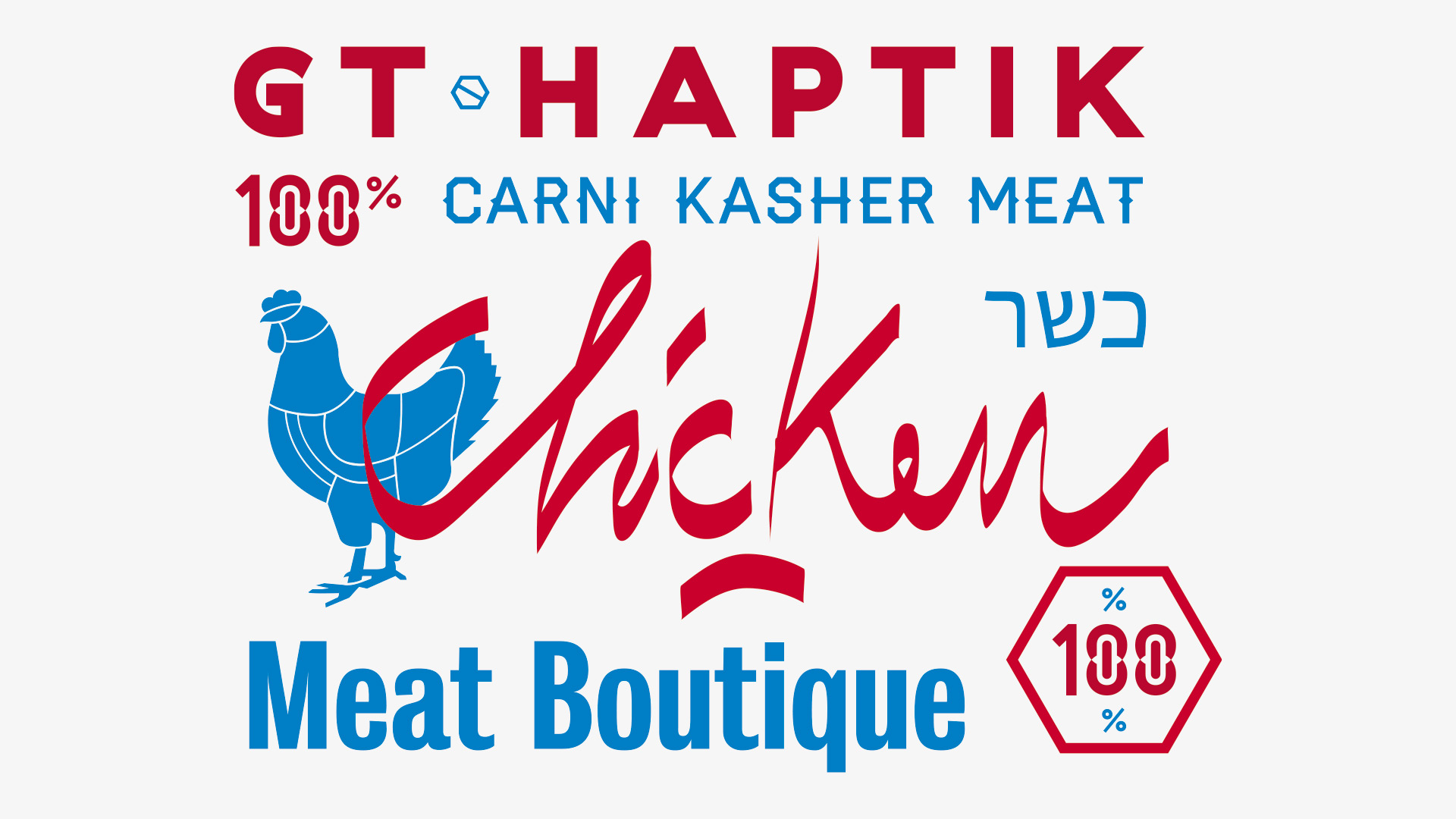
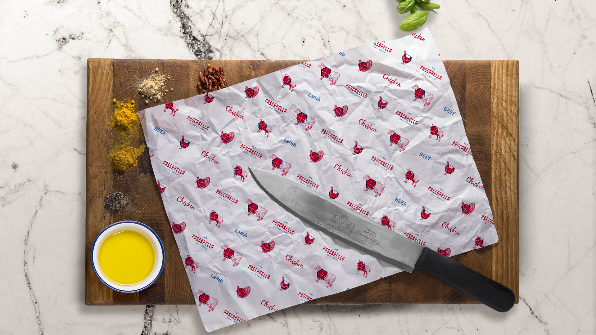
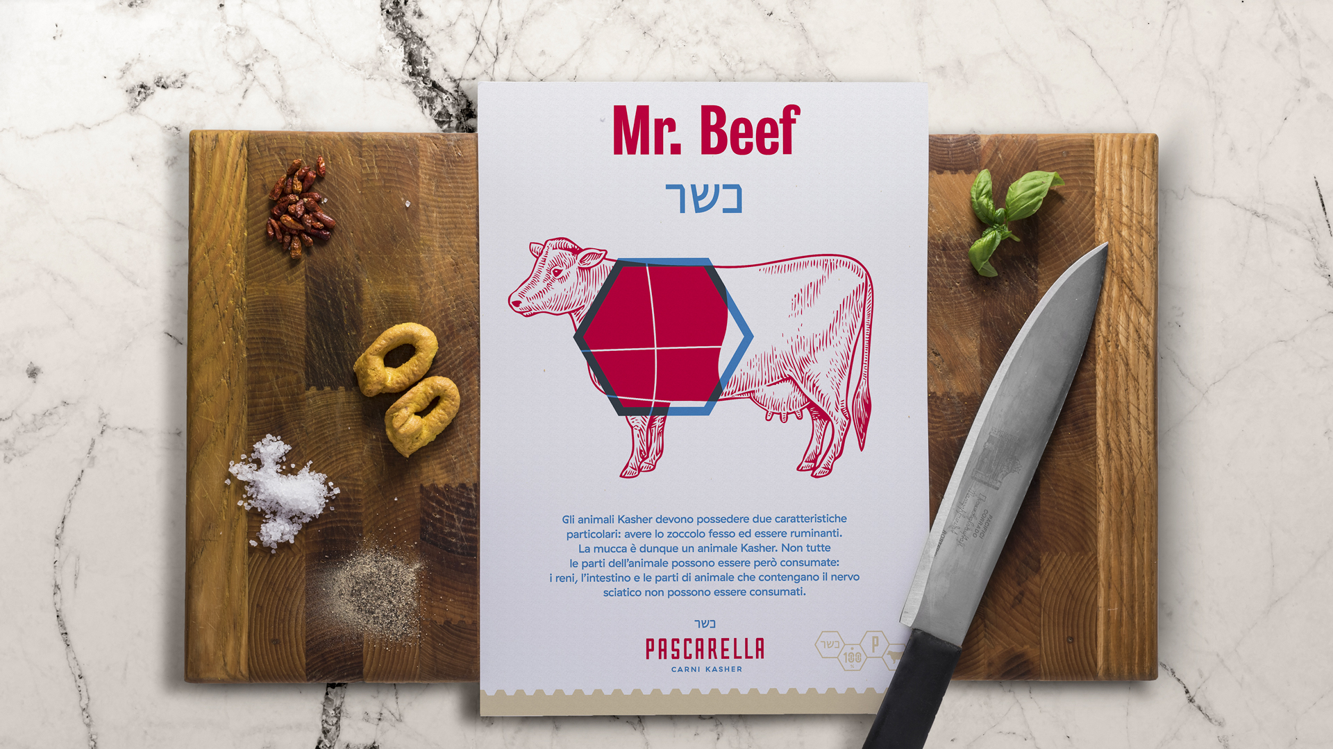
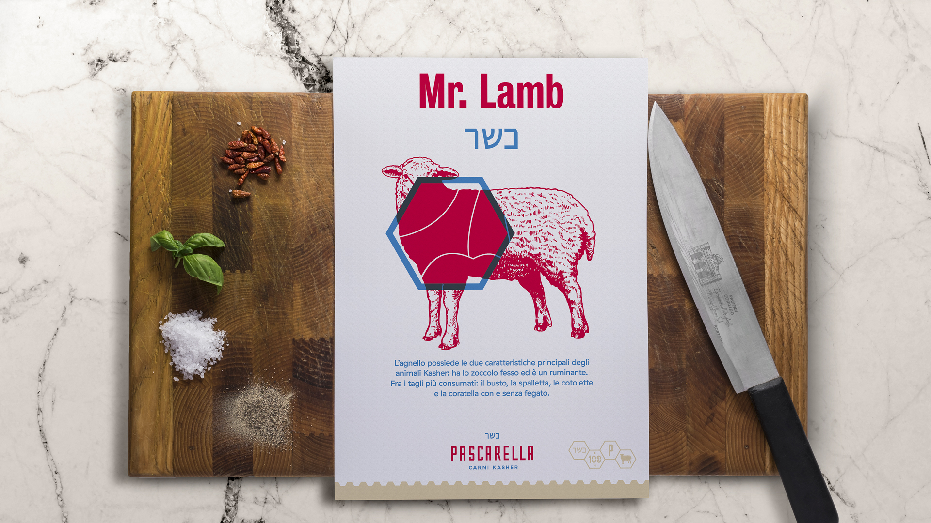
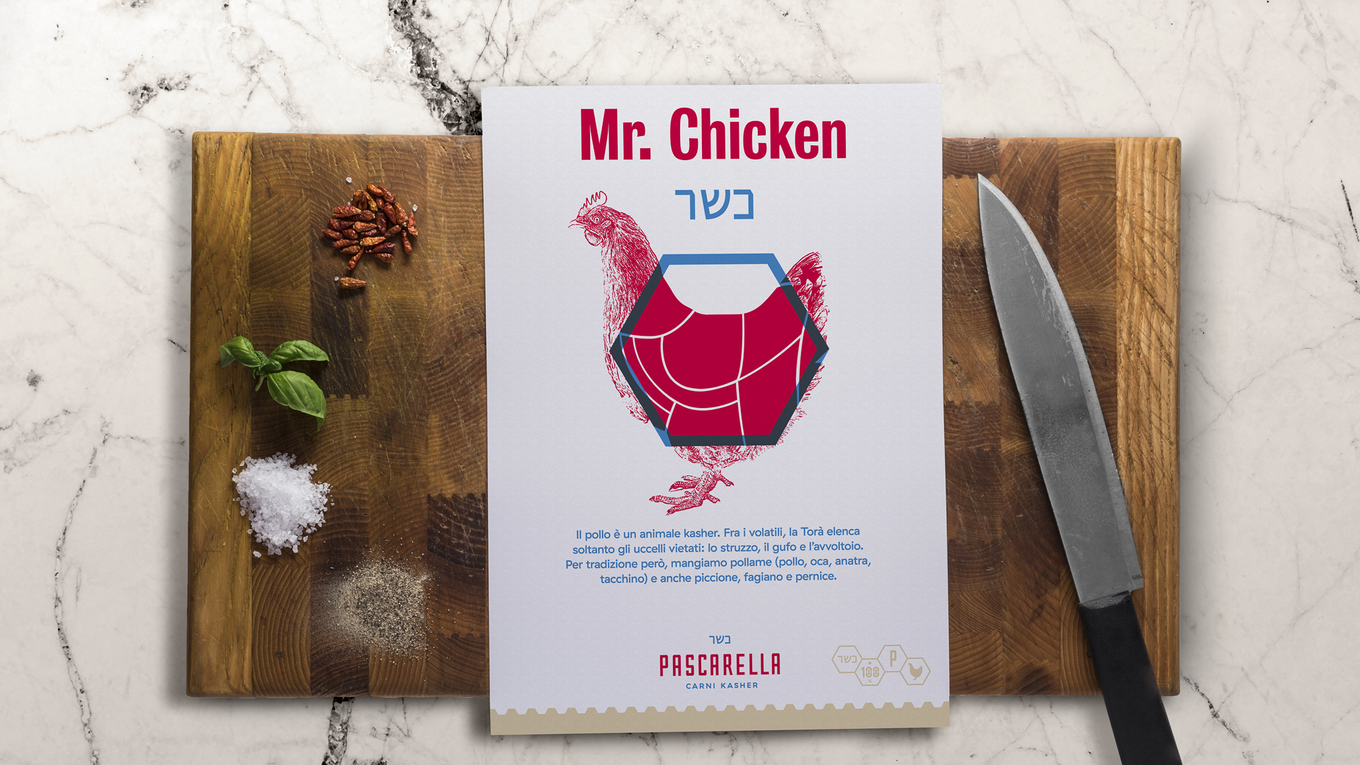
The logo design is based on the hexagon, on the word Kosher written in letters of the Hebrew alphabet, and the dark sky-blue color, all very characteristic of the cultural background. This subject has been thus adopted in other aspects of the identity system, such as website design, social media marketing, and advertising in its various forms.
The result is an effective dissemination of the brand, an increase in brand reputation, a powerful product promotion, and the transmission of Pascarella Carni Kasher’s core values.
Unique Identity.Carving the History.Strategies.